PERLA TENORIO
More is More
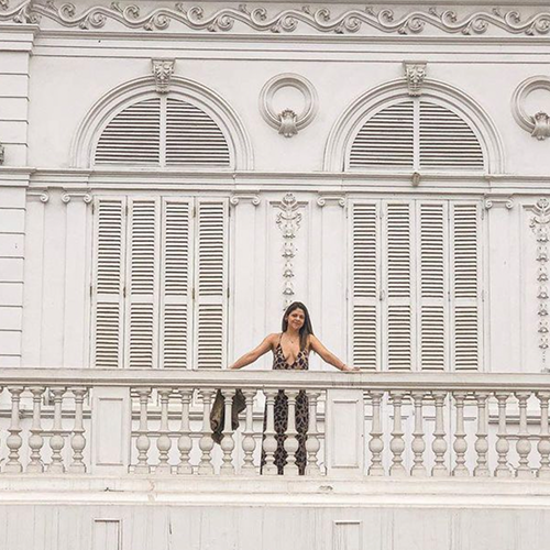
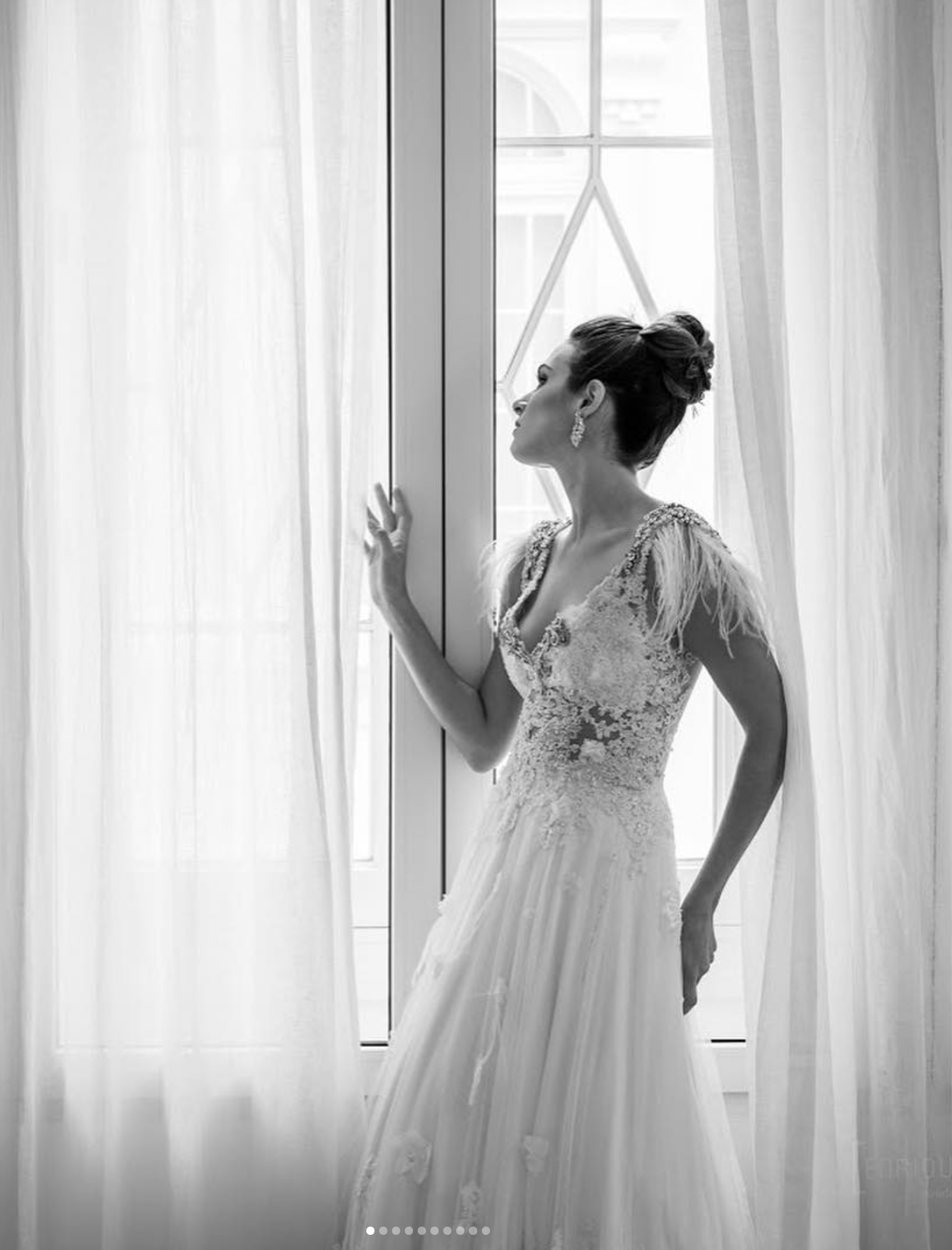
Perla Tenorio is a fashion designer creating bridal couture and casual fashion for empowered women in Lima, Peru. Seeking clarity in her positioning, she initially aimed for a minimalist aesthetic but discovered that it didn’t reflect her true style.
The problem: She needed a brand identity that embraced her natural inclination for maximalism and highlighted her attention to detail. Her lack of clarity led to inconsistent brand applications across various platforms, making it difficult for her audience to connect with her vision.
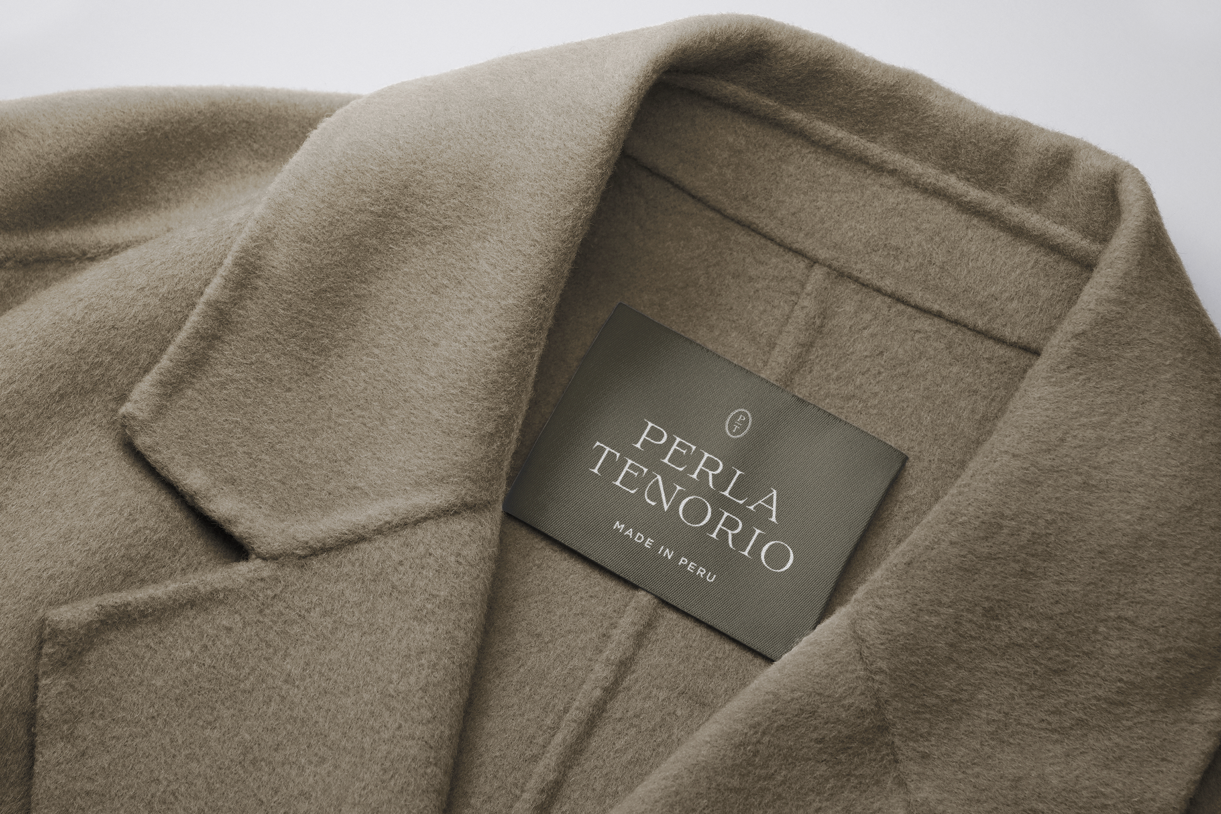
The solution: By embracing her belief that “More is More,” we developed a vibrant brand identity inspired by her French education. Intricate typefaces and a layered logo—a monogram, a two-line serif logotype, an ornamental script, and a minimalist sans-serif descriptor—capture her essence beautifully. To differentiate her bridal line from her everyday collections, we incorporated the tradition of "something blue," using a soft hue that complements her designs.
We also recommended gradually applying her new branding across all client touchpoints, from packaging and labels to thank-you cards and clothing hangers, ensuring that the meticulous craftsmanship in her garments is reflected throughout her brand experience.
Check them out / IG: perlatenorio
BRAND STRATEGY
BRAND IDENTITY
View More Projects
01
NIA RUIZ
FLORA SOL
03
04
MASTERS IN LOVE
EMMA ROSE
02


