KUSKA
Hippie Warmth over Dark Punk
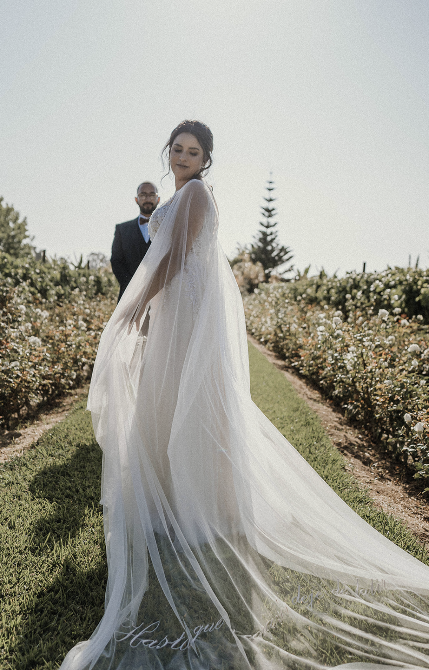
Diego and Paula had outgrown the brand I created for them five years ago and needed a refreshed identity that reflected their growth and unique personality. They wanted something that represented their craft while staying true to their fun, chilled, and outgoing nature.
The problem: As their business evolved, their brand no longer captured their level of skill or vibrant personalities. They felt lost trying to emulate the current industry trend of a dark, “rebel” vibe, which didn’t align with their warm and quirky style. Additionally, they needed a distinct visual identity that would set them apart from competitors.
The solution: We crafted a new brand strategy that emphasized their quirky, lighthearted personalities with bold typography and fun, personal copy. Drawing inspiration from Diego’s podcast, we incorporated signature phrases like "retratistas de parejas que derrochan amor a montones," adding a personal, relatable touch to their messaging.
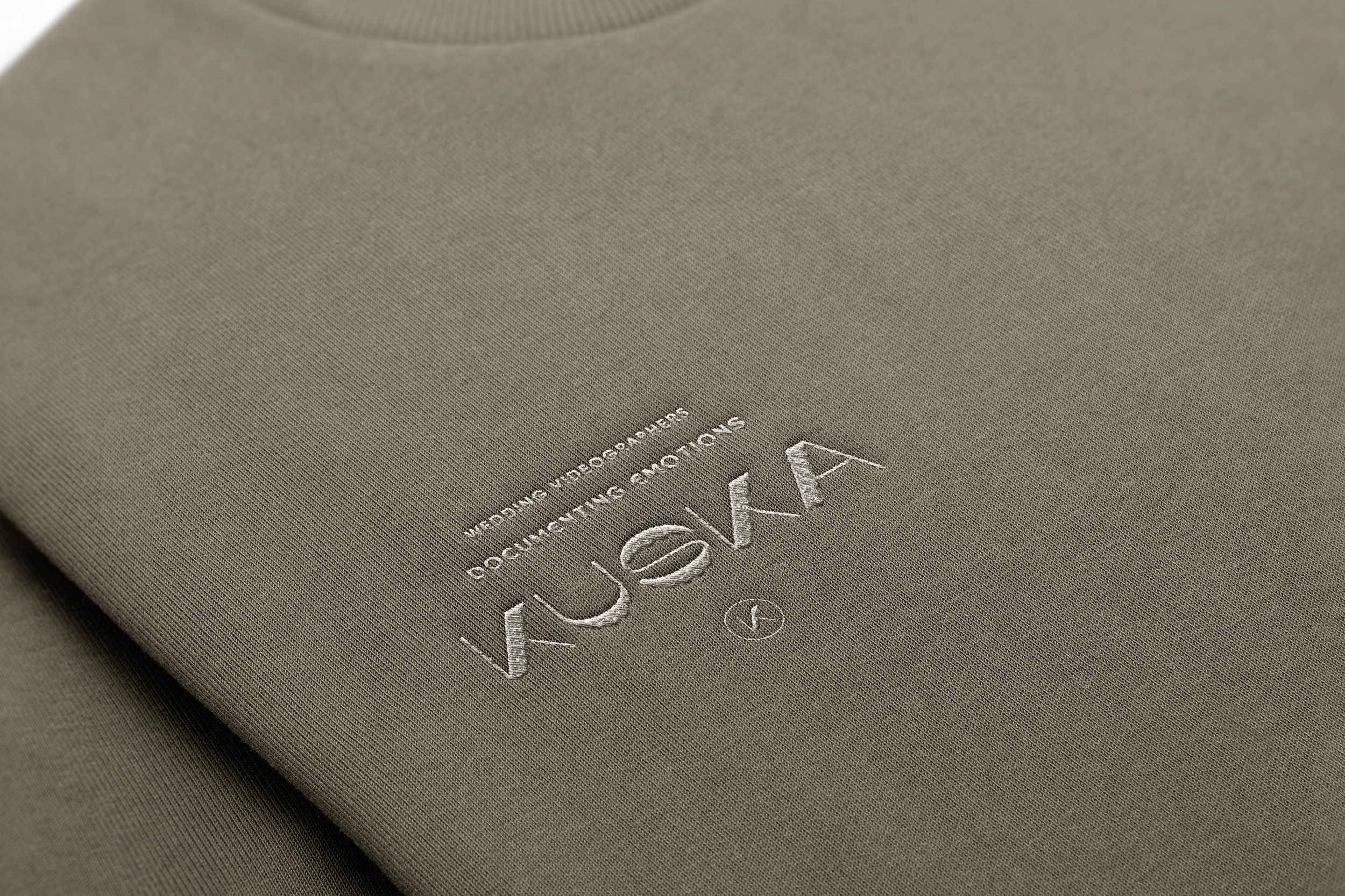
Rather than following the dark trend, we leaned into a "hippie warmth" aesthetic—rebellious in spirit, but true to who they are. The visual direction adopted a vintage vibe, using nostalgic colors, fonts, and grainy editing to create a timeless brand that celebrates their ability to help clients relive cherished memories.
Check them out / IG: @kuska.weddings
BRAND STRATEGY
BRAND IDENTITY
CONTENT STRATEGY
TEMPLATE CREATION
BUSINESS CARDS DESIGN
View More Projects
01
SAINT JOHN’S COFFEEHOUSE
FLORA SOL
03
04
THE MASTERS IN LOVE
SÔLT PROVISIONS
02


