MASTERS IN LOVE
Seekers of Life's Magic
Catherine and Devon, wedding photographers based in Hammond, LA, approached me for a rebranding process after feeling a sense of stagnation in their business. As prior clients, they recognized the need for a fresh identity that reflected their growth and unique personalities.
The problem: Although they had an established brand, it lacked a cohesive identity with defined colors, fonts, and foundational elements. This absence of clarity resulted in messaging that felt confusing and scattered, making it challenging to communicate their true brand essence.
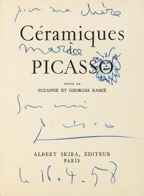
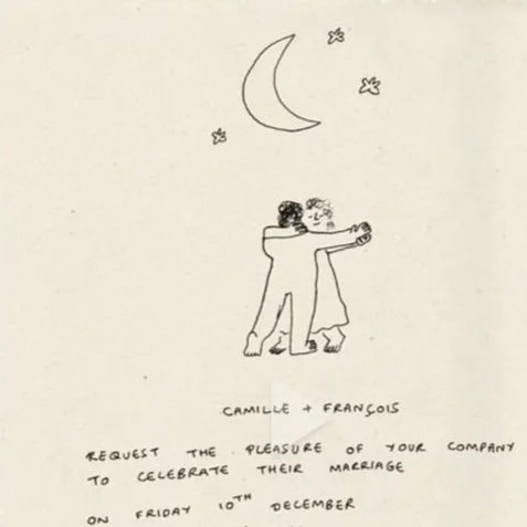
The solution: We embarked on an in-depth brand audit, which revealed the necessity for a more solidified brand identity. We developed a belief system that served as the foundation for all subsequent design work. The updated identity retained a quirky charm to reflect the owners' personalities, while the color palette was boldened with delicate touches of red—suitable for the wedding industry. Our art direction drew inspiration from regal Victorian elements infused with a touch of cozy grandma cottage styling, aligning perfectly with Catherine's vision and the brand's core attributes: kind, tender, nurturing, positive, loving, and cheery. This rebrand showcases the potential for The Masters in Love to resonate more deeply with their audience and consolidate their positioning in the wedding industry.
Check them out / IG: @themastersinlove
BRAND STRATEGY
BRAND IDENTITY
LAYOUT DESIGN


