

SÔLT PROVISIONS
Savor your Simple
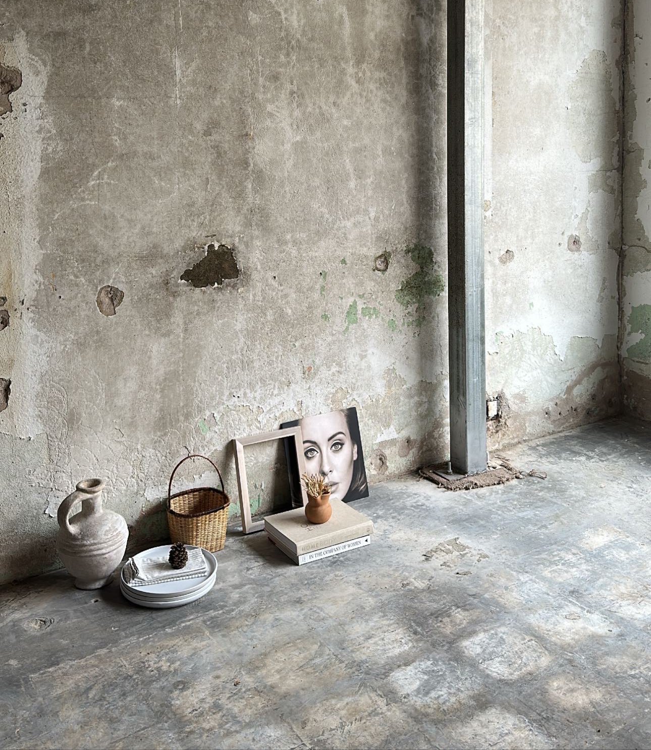
Sôlt Provisions is a French-inspired boutique founded by the owners of Luma, designed to highlight the beauty of the everyday. With the name and vision already in place, they needed a visual identity that embraced the charm of simplicity and the warmth of home life while keeping the brand’s continuity to its sister brand.
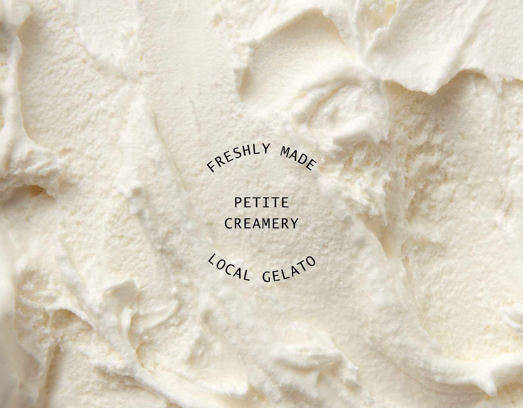
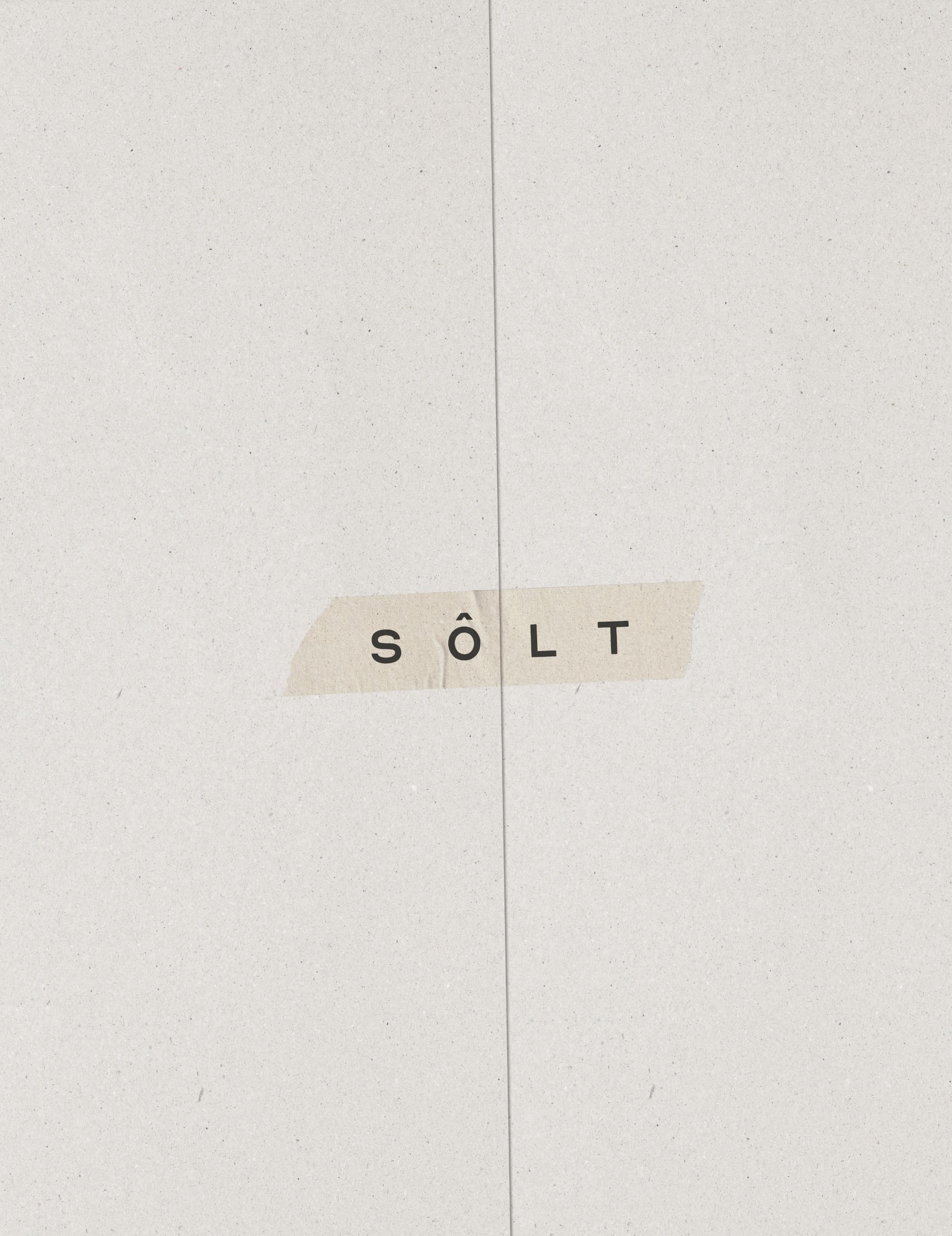
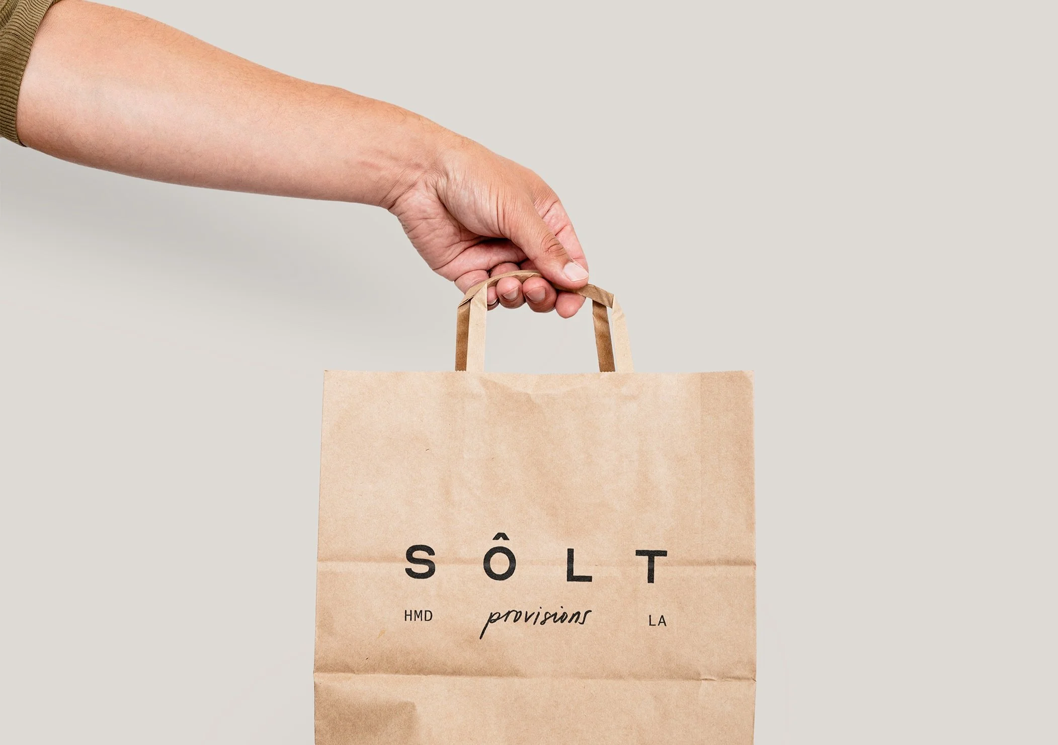
The solution: We drew inspiration from the name "salt," a simple yet essential ingredient, to create a brand identity rooted in everyday beauty. The minimal, light neutral color palette reflects the warmth and ease of provincial life, while the clean san-serif logo offers a modern touch. To connect Sôlt Provisions with its sister brand, we retained a hand-lettered tagline, adding a personal, home-spun feel to the overall design. This branding perfectly captures the store’s essence of savoring the simple and bringing a touch of everyday elegance into the home.
Check them out / IG: @soltprovisions
BRAND IDENTITY
PACKAGING
TEMPLATE CREATION
SIGNAGE


View More Projects

01
SAINT JOHN’S COFFEEHOUSE

VANESSA PODESTÁ
03
04
EMMA ROSE

LUMA COFFEE
02
